Uniqlo Canada
Design Challenge | E-Commerce
Type
Personal Project
Timeframe
1 Week
Toolkit
Sketch, Photoshop, Principle
Year
N/A

Problem
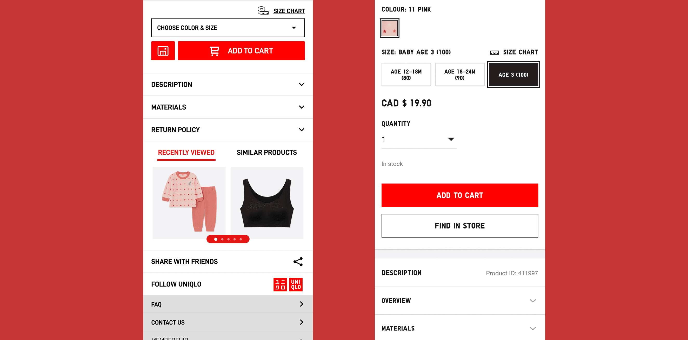
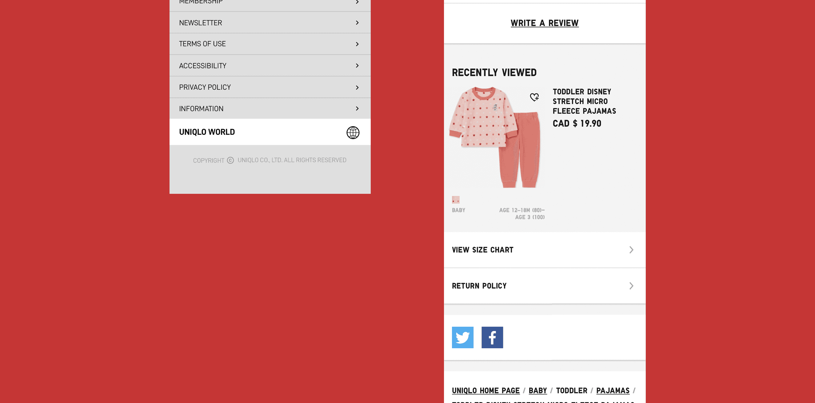
The world-famous Japanese Brand-Uniqlo wanted to have a brand new design of the e-commerce website for its Canadian customers. The current design was complained that it's difficult to use. I was assigned to re-design this page without giving any reference. - The original design doesn't have an aligned UI system to clarify the usage of the UI components, and the page isn't organized well. (Eg. The main navigation menu was at somewhere near the bottom of the page.) - The "Color Selection", "Size Selection", "Quantity Drop Down List" and the "Price" were not efficient for the users to choose. - "Recently Viewed" section took too much space. The layout changed as the number of products increased. - "Write A Review" button was open to anyone who's logged in. - Some features were repeatedly displayed.
Solution
To improve the user experience for Uniqlo’s Canadian e-commerce site, I took a holistic, UX-driven approach. First, I audited the existing layout and UI elements to identify redundancies and usability friction. Without reference constraints, I rebuilt the page architecture from the ground up—focusing on intuitive flow, clean hierarchy, and mobile-responsiveness. Key actions included: • Reorganizing the page structure: I relocated critical components like the main navigation to the top of the page, ensuring consistency with user expectations and best practices. • Optimizing selection modules: I redesigned the color, size, quantity, and pricing selectors into a compact, clearly grouped module—reducing cognitive load and streamlining the purchase path. • Minimizing visual noise: I reduced the footprint of the “Recently Viewed” section and introduced a scrollable carousel to maintain layout consistency regardless of product count. • Clarifying component behavior: I refined interaction patterns to avoid duplicated features and added contextual logic to limit features like “Write a Review” to verified purchasers only. • Establishing UI consistency: I created a lightweight design system to guide spacing, font hierarchy, and component reuse—ensuring visual clarity and brand alignment. Through these improvements, the redesigned experience became more intuitive, consistent, and conversion-oriented—better aligned with both Uniqlo’s brand and its customers’ digital expectations.