HP Control Panel UI Design Language
UI Convergence, Control Panel Interface Design, Human-Machine Interaction Design, Design System
Type
Personal Project
Timeframe
6 months
Toolkit
Photoshop, Illustrator
Year
N/A
Problem
HP had multiple internal design teams, each building their own design language. While this helped individual products stand out, it led to a fragmented brand experience. To solve this, HP aimed to create a unified, recognizable, and sustainable UI design system for all digital products. Our team was responsible for the end-to-end execution of the project — from concept to launch.
Solution
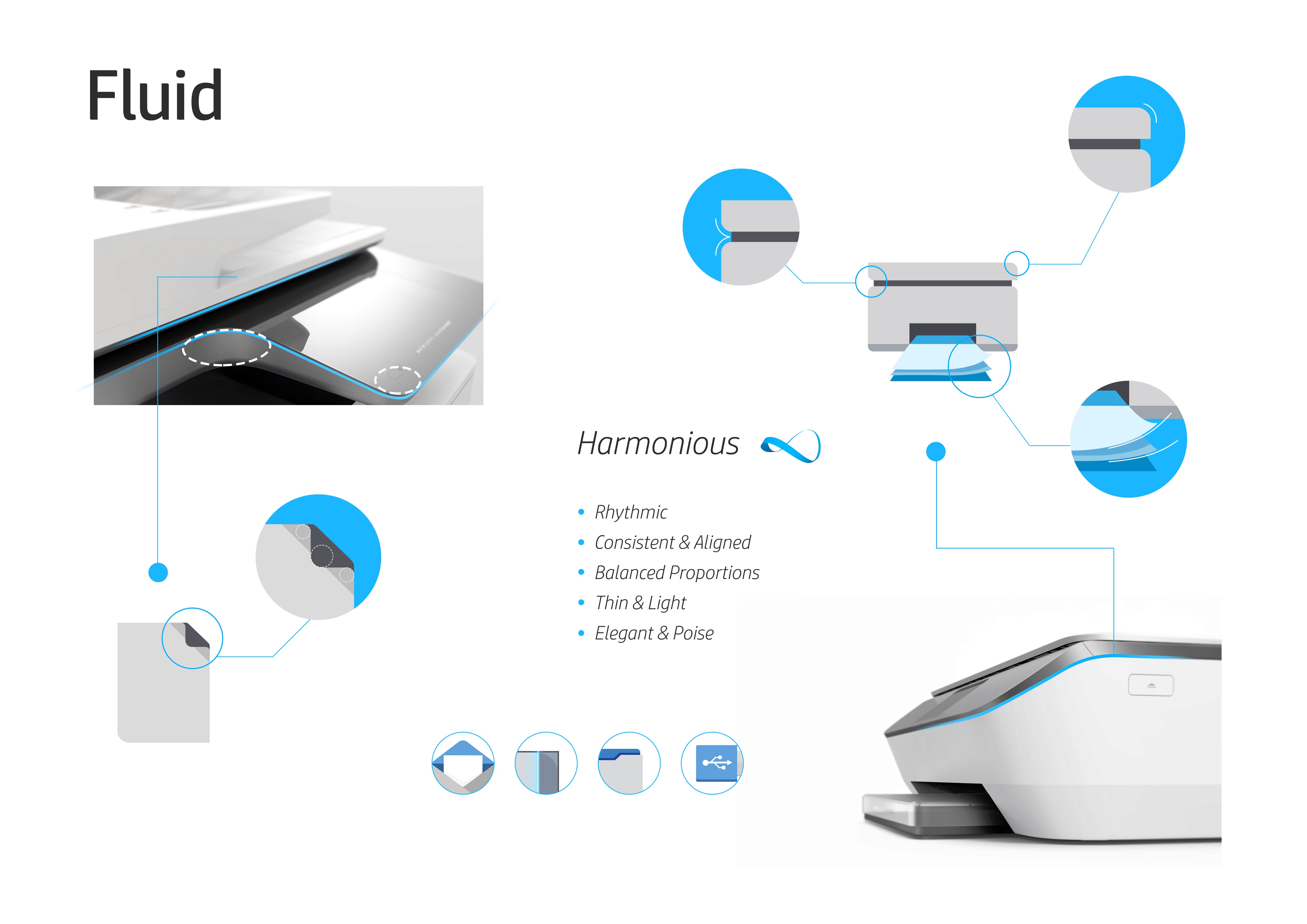
1. Find the existed UI style in the trend curve. Abandon the ones that have been out of the trend. Keep the ones that have potential of being "ever-green". 2. Analyze the common aspects and the differences for each visual style. I found they were all "flat", "simple", "carefully used colors" & "content is the key". I also found they differentiated by "typography", "space between elements" and "whether blurred the background or not". So I concluded the new HP UI design language needs to follow the common features of the trend but also remain its spirit-the PHI.
Various Internal "Brands"
Inconsistent visual expression
Inconsistent color scheme
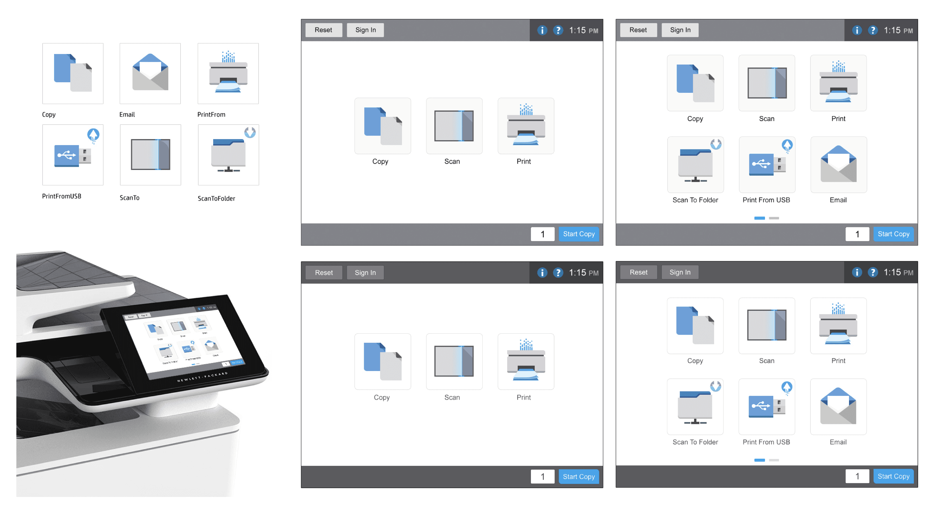
Same function used different icons
I found that within the same company, different product lines had their own "visuals". However, the bright side was that the general info-structure and the interaction pattern were pretty much aligned.
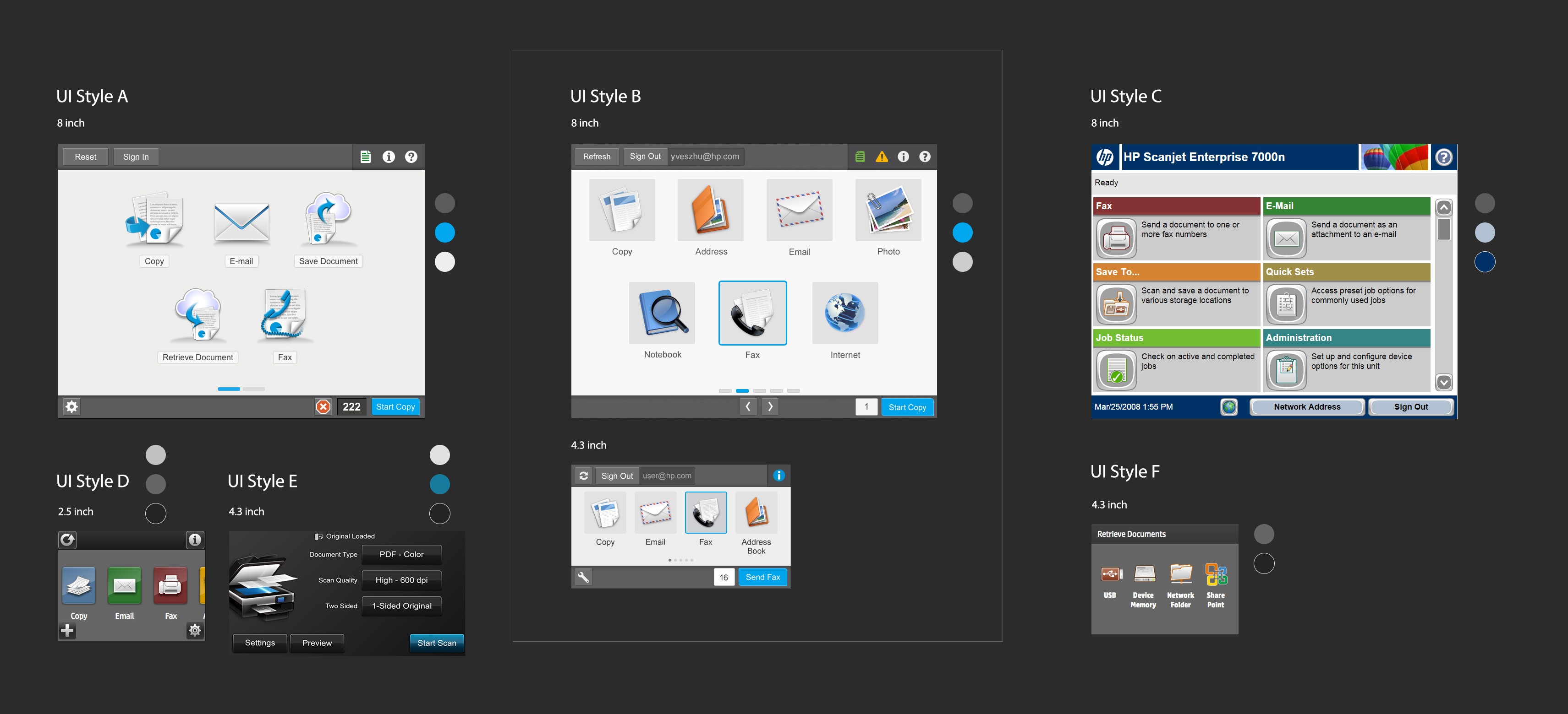
Explore, Explore, Explore


Narrow Down and Convergent


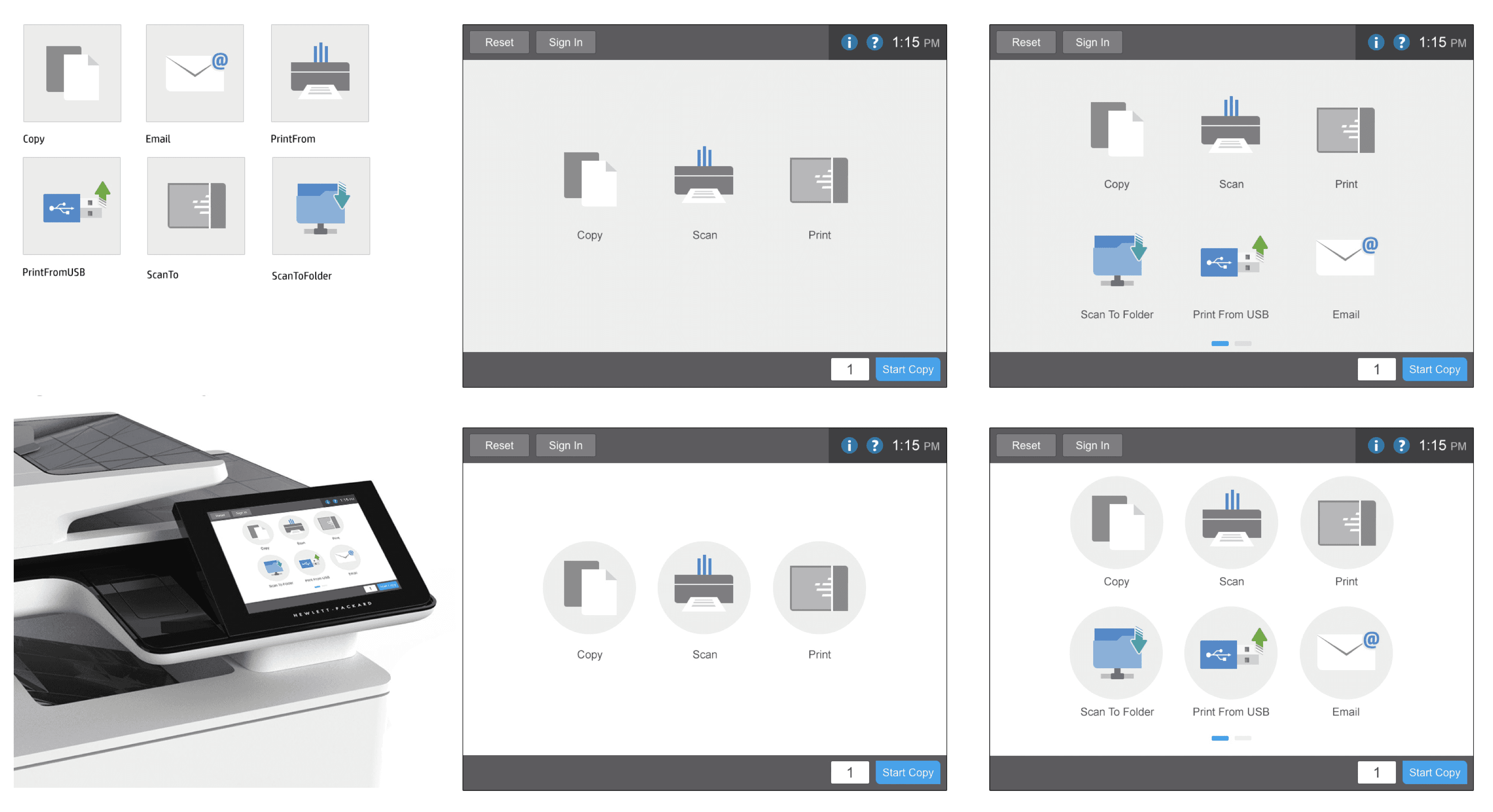
Oh, hey!